Mavik Studios©
Crafting experiences beyond the screens.
Crafting experiences beyond the screens.
MAVIK Studios operates as a corporation with ownership over multiple game development companies. These enterprises work together with Minecraft to produce enjoyable content tailored to the offline and online gaming community (Primarily Minecraft).
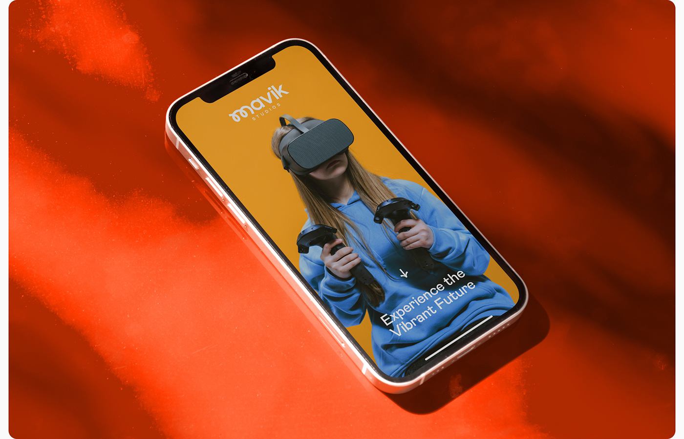
The central values of the company encompass the creation of distinctive adventures, the cultivation of a closely connected player community, and the provision of exceptional products. Tailored for individuals aged 13 to 17, their brand embodies a vibrant and delightful studio dedicated to creating captivating experiences that deeply connect with their intended players.
-
Project Scope: Visual Identity System.
Project Duration: April 2023 – May 2023
Designed by: Prateek S.


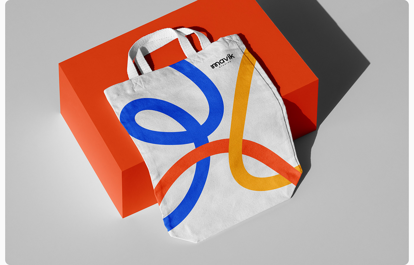
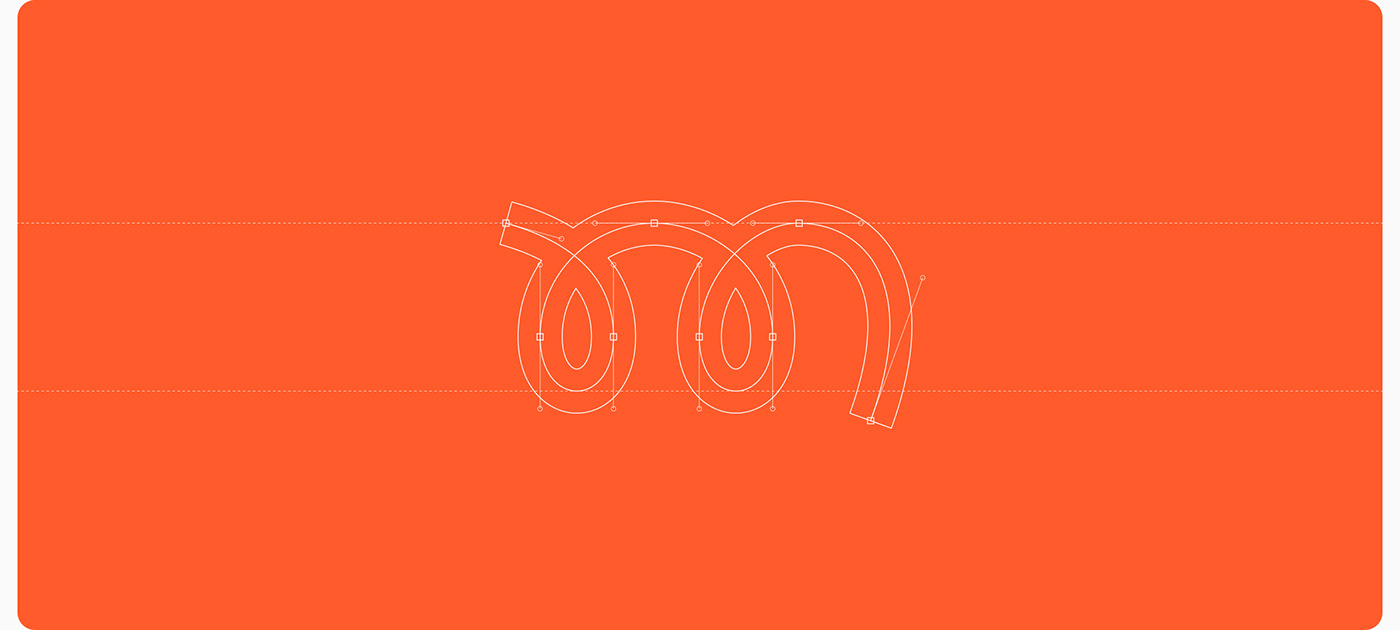
Brand Logo
Playful, Imaginative & Memorable
Playful, Imaginative & Memorable
The Mavik Studios logo showcases a custom-designed wordmark highlighted by a distinctively shaped letter M. This unique M was crafted with playful collaboration, adventure, and imagination in mind, catering to the brand's target audience of 13 to 17-year-olds, ensuring memorability.
The incorporation of scribbles, sketches, and bouncy, round-shaped ovals within the M mirrors the brand's audience, making it easily recognizable with just one line. The two ovals symbolize collaboration, and this scribble style extends as a design element across the entire design system.


Brand Typeface
Mabry Pro Font Family
Mabry Pro Font Family
For Mavik Studios, the chosen official typeface for the brand is Mabry Pro. The font's round shapes match really well with the brand's lively, happy, and energetic style. It's a great choice because it really matches how the brand wants to look and feel. Mabry Pro comes in five different styles: Light, Regular, Medium, Bold, and Black. And it also has slanted versions of those styles, which they call semi-true italics.


Brand Colours
Lively, Vibrant & Youthful
Lively, Vibrant & Youthful
The interplay of vibrant Brandies Blue, Orange Burn, and Squash Yellow speaks to the spirited nature and interests of our youthful audience, capturing their attention with liveliness and excitement. In contrast, Cod Grey and Bianca White offer a neutral backdrop that ensures our brand performs well across all situations. These colors provide a sense of versatility and sophistication, allowing us to adapt and shine in various contexts.